
Landing Page
We use landing pages throughout our Business Design process to understand, communicate and validate our ideas. Here's how to structure one, plus the best practices that matter most.
Content
1. Overview
A landing page is a standalone web page that a person "lands" on after clicking through from an email, ad or other digital location. Once they're on your landing page, users are encouraged to take an action, such as joining your list or buying your products.
Landing pages are a great tool for validating critical assumptions in your Business Model (e.g. sales channels, pricing, brand & message) — even before your product is ready or on the market (using "fake-door testing"). You can also use landing pages very early in the design process to build a shared understanding of your idea within the team, and to communicate it in a tangible, visual way. Use it as a tool to...
...build a shared understanding of your idea as a team
...see and understand your idea from the customer's perspective
...think through the details of your idea as a team (benefits, Target Groups, pains & gains, brand & message...)
...develop a structured story or sales pitch for your idea
...communicate your idea to potential stakeholders (customers, sponsor...)
...get a first impression of how your idea will feel once it's on the market
...get other people excited about your idea
...validate critical assumptions in your Business Model (e.g. sales channels, pricing, brand & message...)
2. Key Elements
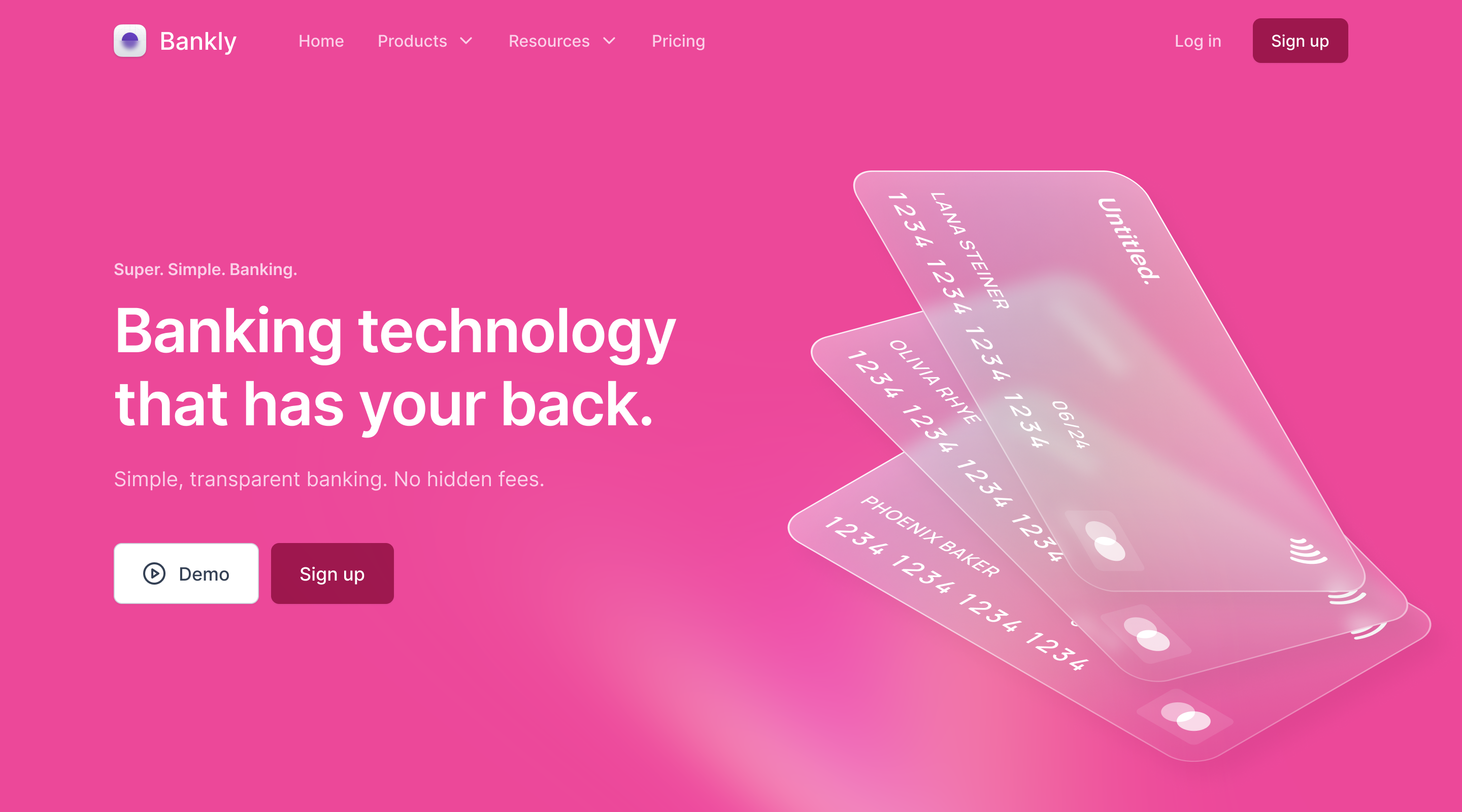
Cover
The cover area is the most important part of your landing page — it's the first thing users see when they visit your site. Within a couple of seconds, a user decides to stay and learn more about what you’re offering, or leave. See "Brand & Messages" and "Primary Target Group" in your Business Model.
Best Practices
If you run Online Ad Campaigns to drive traffic to your landing page, make sure the headline matches your ad copy
Make the headline font larger than any other font on the page
Don't use too much text in your headline
Use a benefit-oriented headline
Put a call to action in the cover area
Use an image or video that emotionally engages your primary target group and fits your brand and product or service
Offering
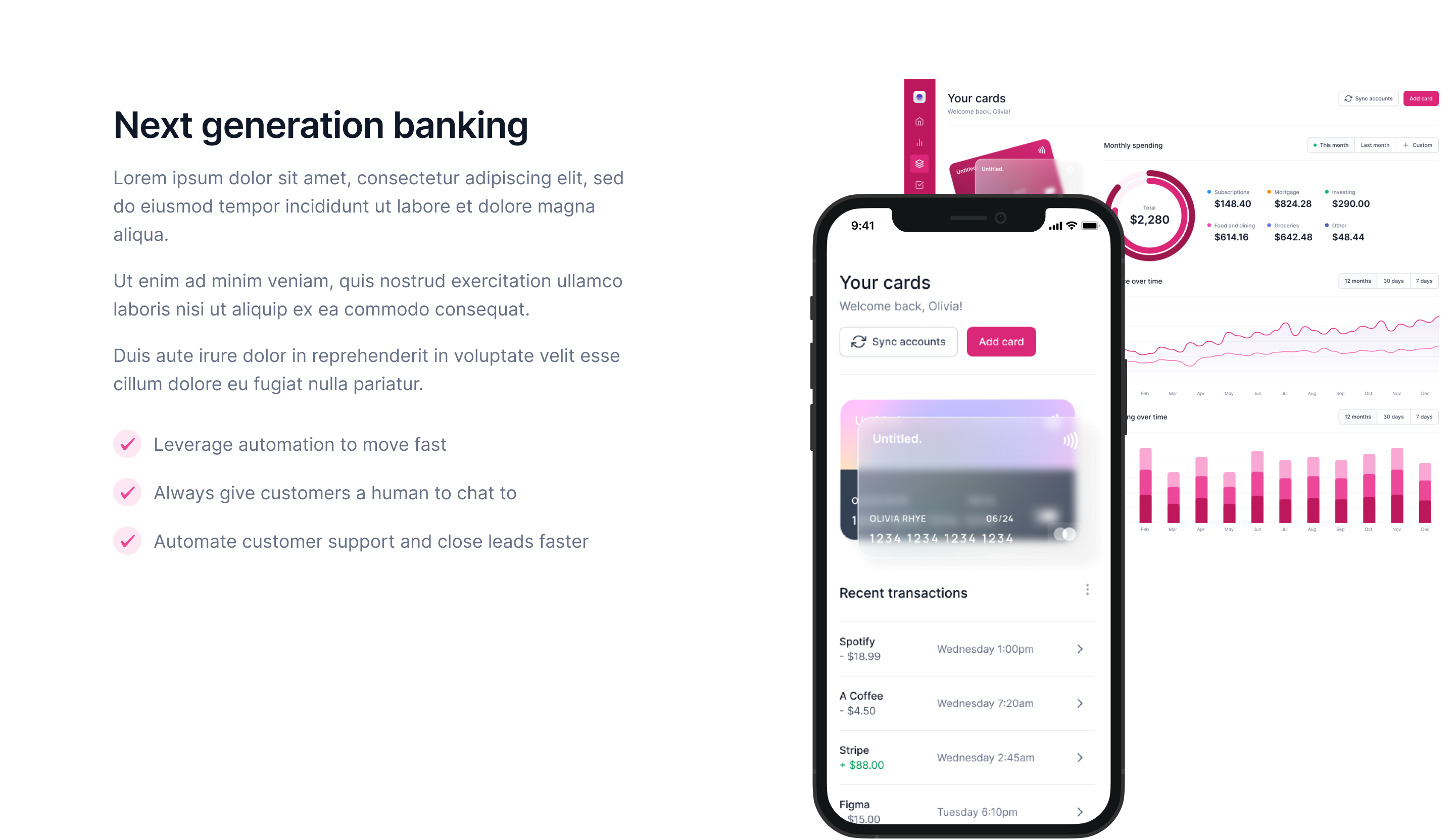
Here you describe what your offering looks like — what you do and which problem you solve. Visitors need to understand whether you can help them get their job done. See "Offerings" and "Job(s) to Get Done" in your Business Model.
Best Practices
Be precise and to the point — there's not much room to describe what you do
Use bullet points to summarise your offering
Use images, drawings or screenshots to visualise your offering
Benefits
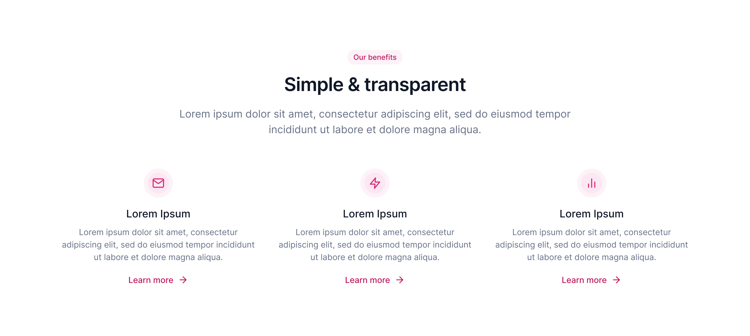
Here you describe how your product or service helps your primary target group get their job(s) done. Customers care not just about what your product or service is, but what they gain from it. See "Pains & Gains", "Job(s) to Get Done" and "Core Value" in your Business Model.
Best Practices
Make sure you talk about benefits, not features
Focus on a maximum of four key benefits
Add visual elements (e.g. icons) that highlight the benefit
Don't use too much text
Solution or Process
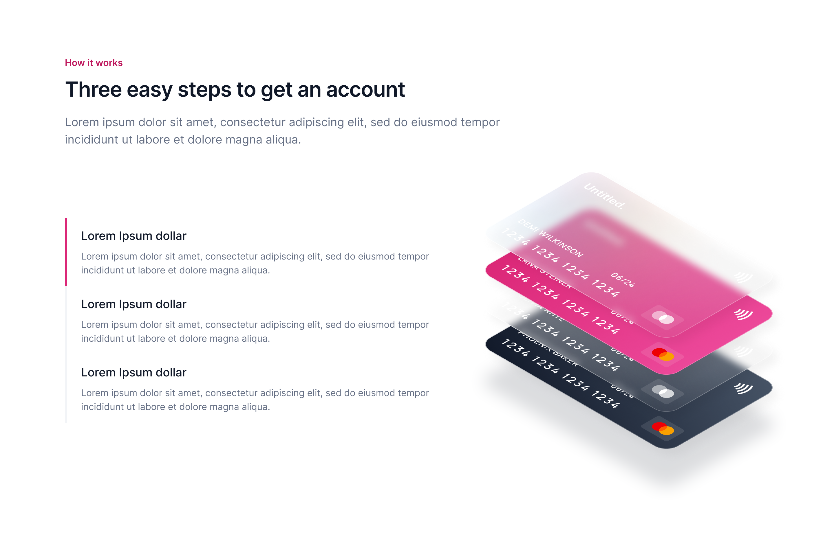
Here you describe how your solution works and what users need to do to experience the benefits of your product or service. See "Offering" in your Business Model.
Best Practices
Describe what happens in simple steps (1., 2., 3., ...)
Visualise steps with icons or screenshots of your product
If your product is complex, simplify how you represent it on the landing page
Testimonials
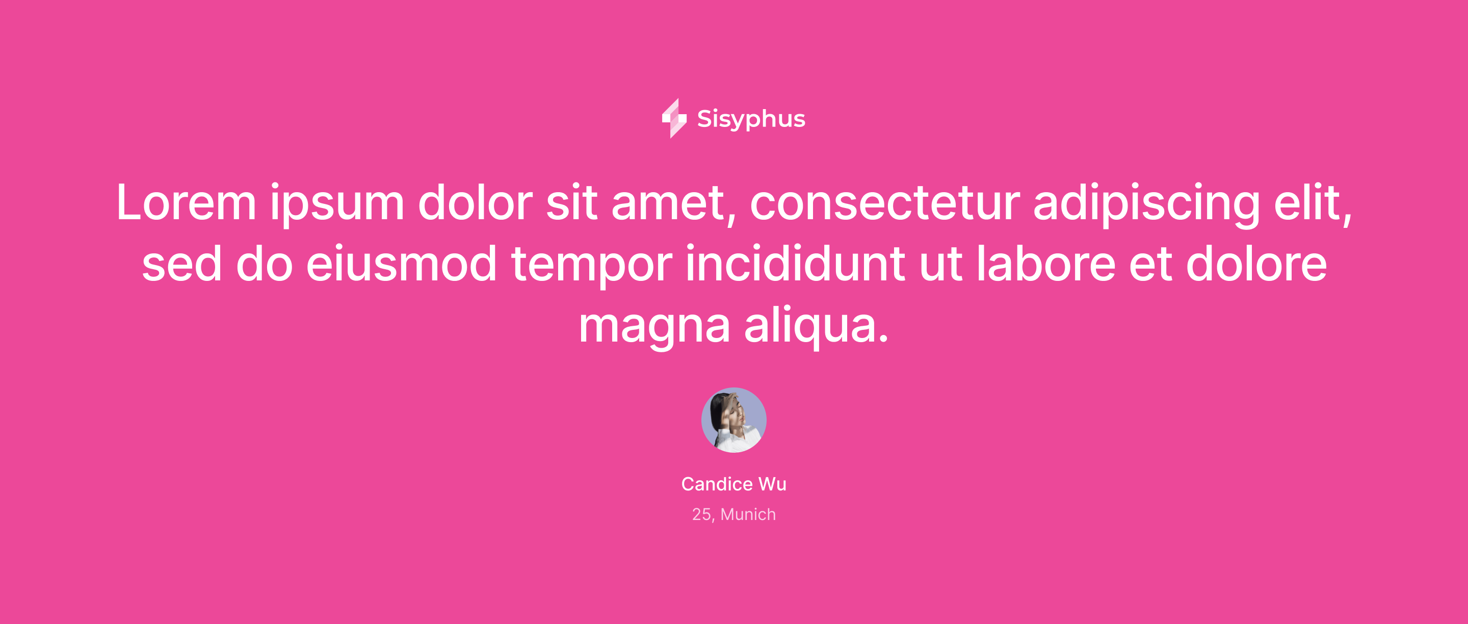
Testimonials show social proof for your product or service. Recommendations from trusted users play a big role in purchase decisions. See all parts of your Business Model.
Best Practices
Include personal details (full name, job title, location, etc.)
Use pictures of your users — it helps build trust
Use testimonials from people who are most relevant to your primary target group
Be specific about features, benefits, etc.
Team
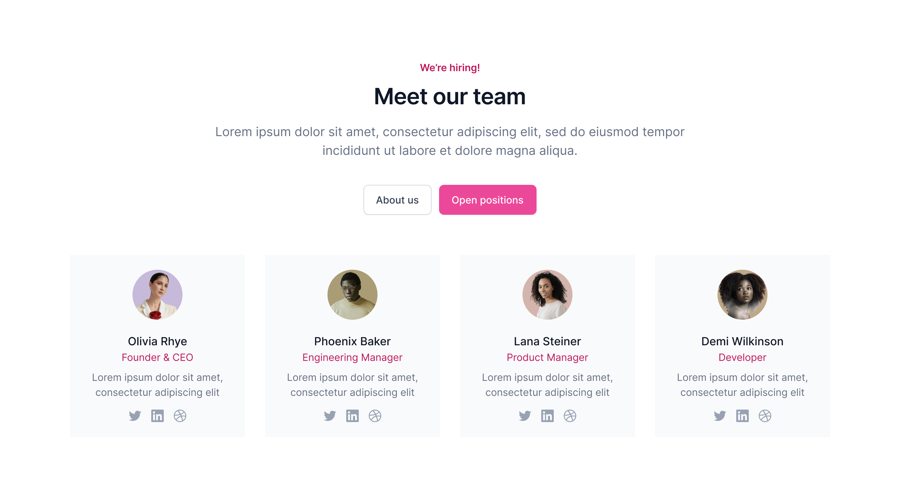
Here's where you talk about yourself. It builds trust in your product or service and shows that the people behind it are experts in the field.
Best Practices
Include pictures of yourself
Add contact options (LinkedIn, email, etc.)
Show your role within the company
Call to Action
This is where you show users what you want them to do — a signup form for your product, a download, a configurator, a newsletter registration, etc. Your call-to-action buttons should point to this area. See "Offering" in your Business Model.

Best Practices
Tell your users exactly what to do
Highlight what your users get
If you can, show your product in action — it helps users picture themselves as your customer
Use it throughout your page
3. Optional Elements
Pricing
Here you present your pricing options and plans. See "Profit Formula" in your Business Model.
Best Practices
Simplicity wins
Highlight the benefits
Use urgency messages
Highlight your call to action
Help users compare options
Highlight the best option
FAQ
FAQs help you anticipate customer questions and clarify the critical points of your product or service.
Best Practices
Use an accordion to save space
Address the fears, uncertainties and doubts (friction points)
4. Investments
When you analyse user behaviour on a landing page, look at different levels of user investment to track how committed they are (see Validating Hypotheses).
Possible "investments" are:
Data Point | Level of Investment |
User clicks "order now" button or enters credit card details | ++++++++++ |
User enters personal data | ++++++++++ |
User enters their email (e.g. newsletter) | ++++++++ |
User contacts us via contact form or chat | ++++++ |
User uses a configurator | ++++++ |
User downloads info material | ++++ |
User scrolls the page (scroll depth) | ++++ |
User clicks "show more" button | +++ |
User views teaser video | +++ |
5. Usage Scenarios
Exploring Questions from your Hypotheses & Experiments template
Validating Hypotheses from your Hypotheses & Experiments template
6. Example Tools
7. Instructions for Coaches
For high-resolution stock photos, use free websites like Pexels and Unsplash, or paid alternatives like iStock and Shutterstock.
Discuss with your team which colours best fit your offering. You'll find colour palettes and gradients on sites like Adobe Color and UI Gradients. For colour shading, use Hex Color Tool.
Decide whether to present your offering on-brand or off-brand, and prepare your landing page accordingly.
Landing pages are a great way to run A/B tests if you want to compare two versions of your offering with different features, pricing, etc.
Our Prototyping Experts build landing pages in hours, not days. That lets you focus on the content and the experimental setup. Contact us if you need support.
If your team is technically savvy (HTML, CSS) or gets support from a Prototyping Expert, ready-made templates save you from starting from scratch (e.g. from ThemeForest). Choose a template with strong preview options for your product or service, plus everything you need to set up your call-to-action button or contact form. Pick a responsive template to save time.
If your team isn't familiar with HTML or CSS, visual web-page builders (like Wix or Launchrock) let them set up a landing page quickly from templates. Be aware: these tools can eat up your time the moment you want to change more than text, images and colours.
If you're using a landing page to validate a hypothesis, get your team together to prepare the content based on your Hypotheses & Experiments. Don't forget to set up an Online Ad Campaign or other promotional campaign to drive traffic to your landing page, and install Software / Sensor-based Tracking to monitor user behaviour if needed.
8. Miro Board
We built a Miro board to help teams build their landing pages. Drop us a line if you need editing rights to use it in your own workshops.
Keep in mind
Have a look at it: https://miro.com/app/board/uXjVO6pcwLU=/